


Spring is typically when clients start asking for brighter tones, softer pastels, and playful sets that feel fresh after the dark winter months. For nail professionals, this is the perfect time to refresh your color wall and experiment with new combinations. If you’re planning your seasonal menu, these must-try acrylic powder colors for spring will help you stay on trend while giving clients something they’re excited to wear.
Working with high-quality acrylic powders makes all the difference in color payoff, blendability, and retention. Whether you’re creating full-color sets, French designs, or detailed 3D art, the right shades can instantly elevate your work.
Why Spring Color Trends Matter in the Salon
Spring services often mark a shift in mood. Clients want lighter tones as well as fun details and designs. Updating your acrylic powder selection keeps your services aligned with seasonal demand.
For nail professionals, this means:
- Offering trend-forward shades clients see on social media
- Refreshing sample swatches
- Creating limited-time seasonal design menus
Pastel Revival With a Modern Twist
Pastels never truly leave, but each year they evolve. For Spring 2026, expect to see creamier undertones and slightly muted finishes rather than bright, flashy shades.
Shades like blush pink and soft lilac create a clean base for French variations and structured overlays. These colors are especially popular for bridal season and graduation sets.
Pastels also work beautifully with:
- White line art
- Glazed chrome looks (which remain popular going into 2026)
“Skittle” designs (where each nail is a slightly different shade of the same color)
When working with lighter acrylic powders, proper ratio control is key. Too wet, and the color may look sheer. Too dry, and blending becomes difficult.
Metallics and Chrome
Metallic accents are making a strong statement this spring, especially when layered over soft bases. Chrome and gold detailing add visual interest without overwhelming the design, making it a popular request for clients who want something elevated but still wearable.
Starting with a neutral base—like Cover Beige Acrylic Powder or Natural Pink Acrylic Powder—follow with designs created with a thick builder gel. After curing, top with chrome powder or gold or chrome gel paint for a reflective effect. The contrast between matte pastels and nudes and metallic shine creates a modern, editorial look.
This style works for any nail length and shape, plus it’s a great upsell opportunity in the salon.
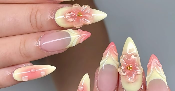
Fresh Florals and Bloom-Inspired Tones
Floral designs dominate spring every year, but it’s the colors used that make the design pop. Think soft sage greens, baby blues, and petal pinks.
Glitter bases can add dimension when layered beneath 3D floral designs. Glitter-infused acrylic powders also allow you to build subtle sparkle without overpowering the design.
Try pairing bloom-inspired shades with:
- Hand-painted flowers
- 3D acrylic flowers
- Matte finishes
These designs are ideal for clients who want something seasonal but still wearable for everyday life.
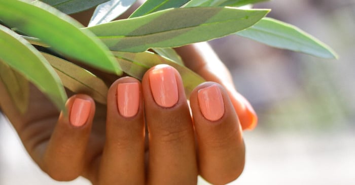
Bright Corals and Playful Pops
That said, not every client wants the soft tones most widely associated with springtime. Some come in ready for color that makes a statement.
Coral and warm-toned pink acrylic powders will be strong choices for vacation season. These shades work beautifully in full sets, color-block designs, or vibrant ombré blends.
Consider experimenting with:
- Coral-to-nude ombré
- Colorful French tips
- Abstract swirls using two complementary brights
Applying clear 3D designs (think: swirls, pearls, and shell-like stripes) over bright ombrés is an increasingly popular way to achieve beach-ready designs, so expect these requests as spring break approaches.
Milky Neutrals That Complement Bright Outfits
No matter the season, there will be some demand for a minimalist option. Milky whites and soft beige tones are requested frequently by spring clients who prefer understated sets that won’t stand out too much.
Clear acrylic powder is essential for creating custom milky blends. Mixing a small amount of white pigment into clear allows you to control opacity while maintaining that soft-focus finish.
These shades are perfect for:
- Short structured overlays
- Subtle encapsulated shimmer
- Minimal line work
Clean neutrals also photograph well, which is helpful for building out your portfolio and social content.
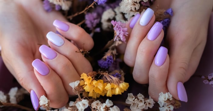
Bold Lavender and Statement Purple
Lavender remains a seasonal favorite, but deeper purple gem-like tones are gaining attention this year. These shades complement a wide range of skin tones.
A color like lavender makes a strong statement on its own, but it also blends beautifully into pinks and blues for gradient effects.
Purple tones are ideal for:
- Full sets
- Encapsulated silver and gold decals
- French twist tips
Mixing Custom Shades for Clients
One advantage of working with professional acrylic powders is the ability to mix custom colors. Spring is the perfect season to experiment with blending pastel bases and shimmer additives.
Custom color creation and unique design enhancers set your services apart while keeping your menu flexible. It also encourages clients who want something different every time they visit to test out more expensive offerings.
Building a Balanced Spring Collection
You don’t need every shade available. Instead, focus on a balanced selection that supports multiple design styles.
A well-rounded go-to spring assortment may include:
- One soft pink
- One neutral base
- One statement pastel
- One bright coral or bold pink
- Clear acrylic powder for layering and mixing
This combination allows you to create dozens of variations without overwhelming your workspace.
Choosing Quality Acrylic Powders Matters
Color trends are exciting, but performance is what keeps clients returning. Smooth application, consistent pigment, and reliable retention should always come first.
Mia Secret acrylic powders are formulated under strict quality control standards and are trusted by professionals in over 120 countries. For salon professionals working with multiple clients per day, that consistency matters.
Refresh Your Spring Menu
Updating your service menu for the season can be simple. Consider highlighting limited-time spring sets featuring florals, pastel French tips, or 3D art.
Display fresh swatches and highlight seasonal designs on social platforms to spark interest. When clients see new color options, they’re more likely to try something different.
If you’re stocking up for the season, now is the time to explore the full selection of colorful acrylic powders from Mia Secret. A refreshed color lineup helps you create on-trend sets that clients will request all season long.
Final Thoughts on Spring Color Trends
Spring 2026 is all about balance. Soft pastels sit alongside bold corals; milky neutrals share space with shimmers and 3D chrome powders; and 3D as well as encapsulated designs continue to delight clients as much as two-tone ombrés.
By keeping these must-try acrylic powder colors for spring in your rotation, you can create sets that feel current, customizable, and creative. Investing in high-quality acrylic powders will help you bring every spring design idea to life.